
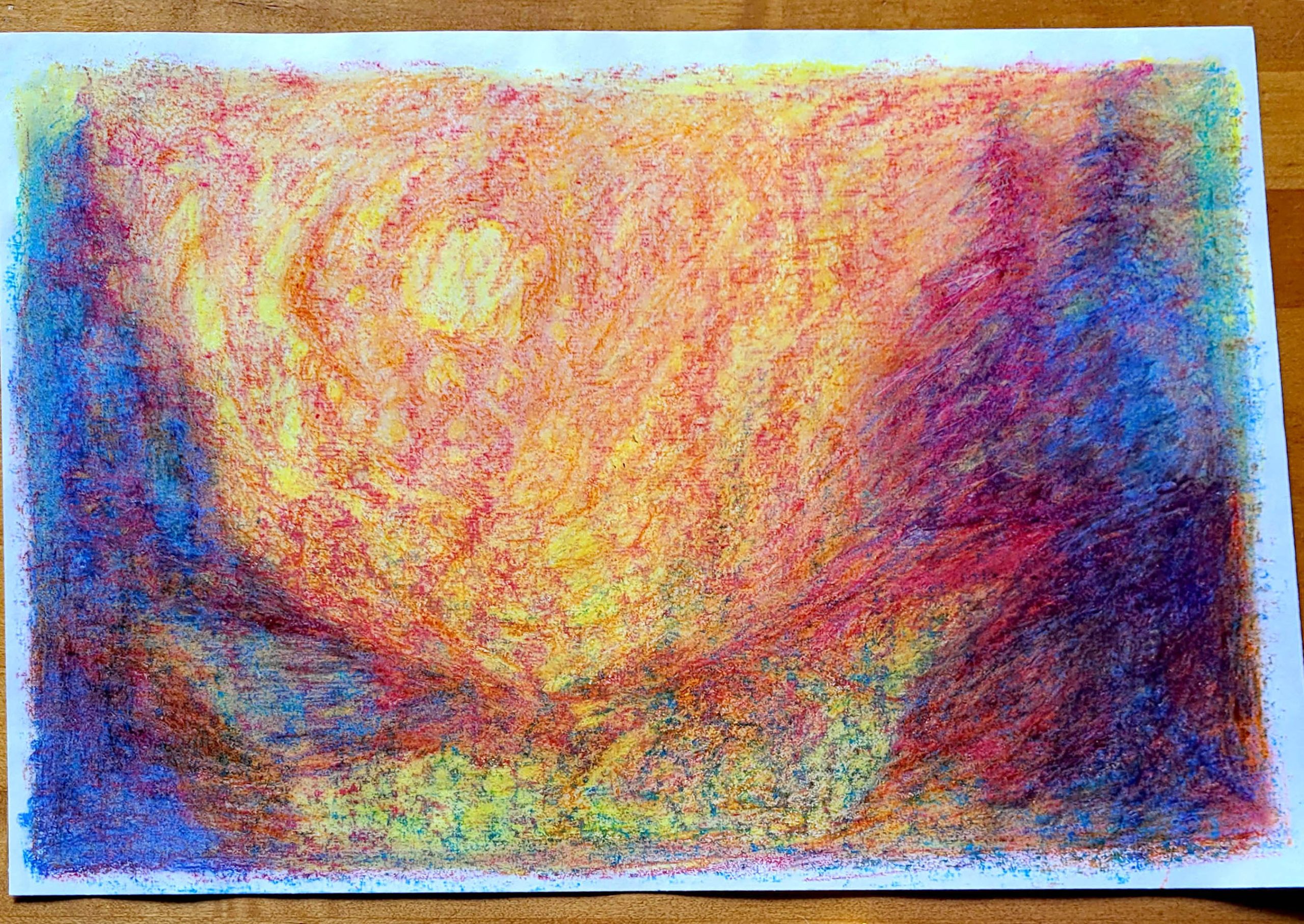


Why We Created Two Early‑Grade Primary Sets
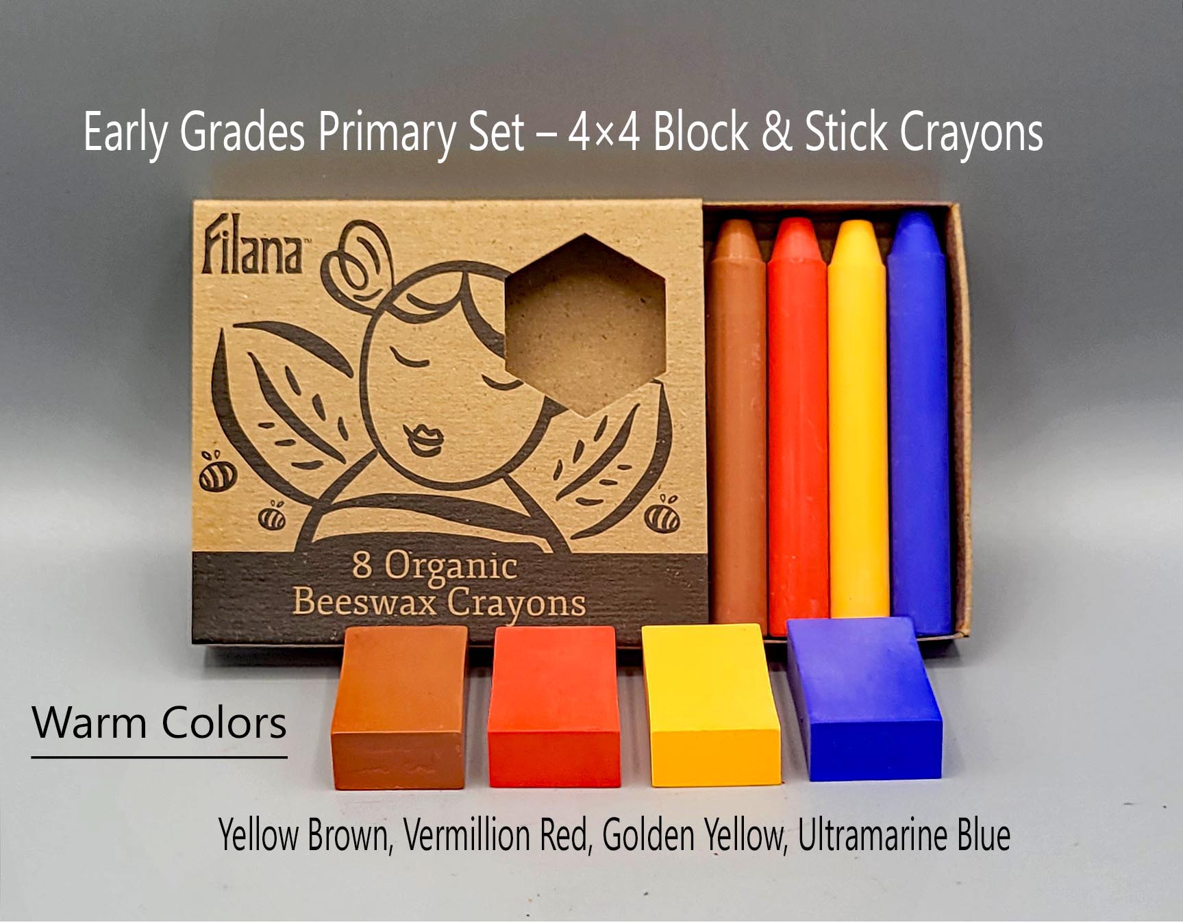
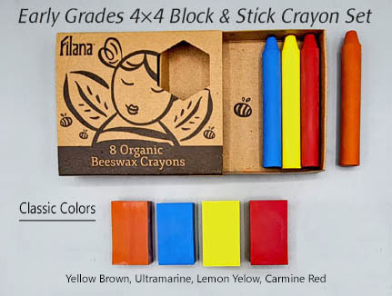
In the early grades, children move between big, sweeping gesture and the first beginnings of intentional line. Their drawing tools must meet this developmental moment with simplicity, beauty, and purpose. Teachers tend to prefer one of two early‑grade palettes — either the traditional cool‑warm balance or a warmer, sun‑forward palette. We created two 4×4 sets so teachers can choose the palette that best fits their classroom mood, curriculum, and artistic style.
Both sets offer the four essential tones used throughout early Waldorf work, giving children everything they need — and nothing they don’t.
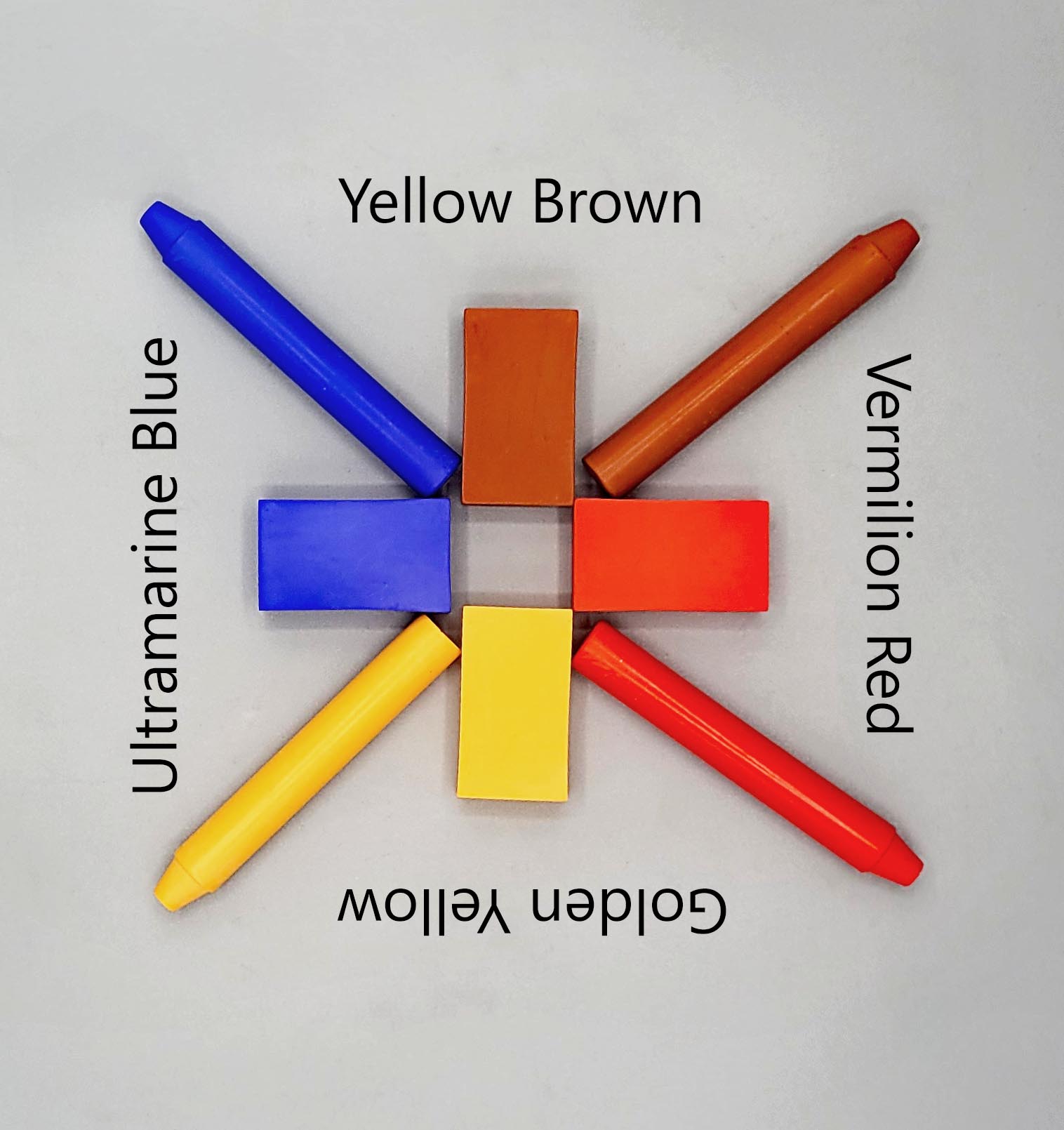
Why Blocks and Sticks of the Same Color
Block crayons invite broad movement, shading, and the feeling of form. Stick crayons invite detail, edges, and definition. By offering both shapes in the same four colors, children learn that a color can speak in many ways: wide, soft, strong, narrow. They experience form and line as a unified language rather than separate tools. This supports the natural shift from whole‑arm drawing toward more intentional line work in Grades 1–2.
The Two Palettes
Classic Primaries (4 Colors)
A cool‑warm balance that reflects the traditional Waldorf Grade 1–2 palette.
Carmine — the storyteller
Carmine carries warmth without shouting. It brings gesture, kindness, and a gentle sense of life. Children use it for hearts, warmth, clothing, and soft red forms that feel alive but not loud.
Lemon Yellow — the spark
Lemon Yellow is bright, quick, and clarifying. It brings freshness, openness, and the feeling of morning light. Children reach for it when they want brightness, clarity, and the first sense of illumination.
Ultramarine Blue — the deep breath
Ultramarine is calm, cool, and centering. It brings depth, quiet, and the feeling of sky or water holding everything together. Children use it to balance warmth, create space, and soften intensity.
Yellow Brown — the grounding stone
Yellow Brown offers structure without heaviness. It gives children a way to create earth, trunks, animals, mountains, and shadow. It steadies the drawing and keeps the palette warm and alive.
Warm Primaries (4 Colors)
A richer, sun‑forward palette that brings warmth, radiance, and expressive energy.
Vermilion — the heartbeat
Vermilion is bold, warm, and full of movement. It carries gesture, enthusiasm, and the feeling of life rising upward. Children use it when they want warmth, action, and expressive forms.
Golden Yellow — the sun‑bearer
Golden Yellow is steady, bright, and generous. It offers clarity, warmth, and the feeling of midday light. Children reach for it when they want openness, brightness, and a sense of spaciousness.
Ultramarine Blue — the deep breath
Ultramarine centers the palette, bringing coolness, depth, and quiet. It softens intensity and helps drawings breathe.
Yellow Brown — the grounding stone
The anchor of the palette. It offers structure without heaviness and supports the child’s sense of place — earth, trunks, animals, mountains, and grounding forms.
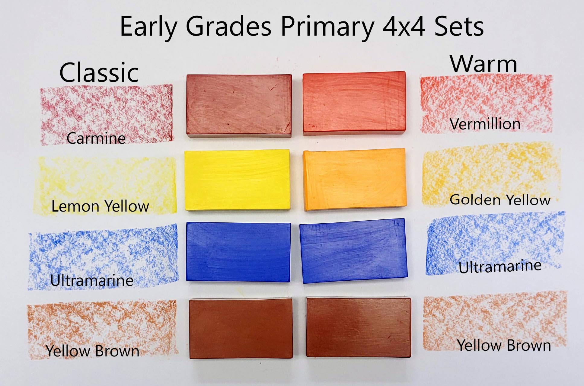
Why a Teacher Might Choose Classic or Warm
Classic Primaries
Carmine (bright red) and Lemon Yellow (bright, morning yellow) create a palette that feels fresh, clear, and balanced. Carmine’s bright red brings life without heat, and Lemon Yellow offers clarity without heaviness. Together, they support the traditional early‑grade mood: gentle gesture, clean form, and a sense of morning light.
Teachers who choose Classic often want:
- the familiar Waldorf Grade 1–2 color relationships
- a bright red that feels lively but not fiery
- a yellow that feels clarifying and fresh
- a palette that supports early form drawing and calm main lesson pages
Classic is chosen by teachers who prefer clarity, balance, and a traditional early‑grade feel.
Warm Primaries
Vermilion (orangey red) and Golden Yellow (warm, sunlit yellow) create a palette that feels radiant, expressive, and full of warmth. Vermilion brings gesture, movement, and emotional richness, while Golden Yellow offers a steady, glowing warmth. Together, they create a midday‑sun palette that feels open and generous.
Teachers who choose Warm often want:
- a red that feels warm, expressive, and story‑rich
- a yellow that feels glowing rather than bright
- a palette that supports lively illustrations and gesture
- colors that bring warmth and emotional depth into the classroom
Warm is chosen by teachers who prefer radiance, warmth, and expressive storytelling.
Both palettes are fully appropriate for Grades 1–2. The choice simply reflects the teacher’s artistic preference and the mood they want to bring into the classroom.
What These Sets Support
- Form drawing
- Early main lesson work
- Story illustration
- Gesture and line development
- Uncluttered drawing experience
Each Early Grades Primary Set is intentionally small and designed to help young children draw with confidence and joy. The difference is simply teacher preference — the emotional tone they want to bring into the room and the way they want color to meet the child.


